
How to use the Aspect Ratio Converter
Set the target shape
The first two fields are the ratio you want, such as 9 and 16.
Type any field
Change the source width, the source height, or the target ratio. Crop and pad both update as you type.
Read both sizes
Crop is the cut that fits. Pad is the larger canvas with bars.
Summarize with
When to convert aspect ratios
Landscape YouTube (16:9) to a vertical story (9:16) is the usual job. Crop cuts the sides; pad adds bars. Stretching distorts faces, so the converter does not offer it.
Photos going to Instagram 4:5 need a different crop than 1:1. The cards above update from the same convert formulas used in fixtures.
Worked convert examples
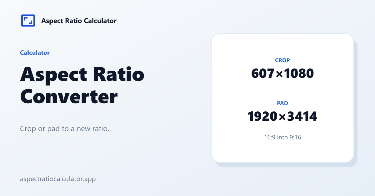
1920×1080 → 4:3 crop 1440×1080, pad 1920×1440. 1920×1080 → 9:16 crop 607×1080, pad 1920×3414. 4000×3000 → 16:9 crop 4000×2250, pad 5334×3000.
Common mistakes
Using the wrong source. Convert needs the stored pixel size, not the display size after a player letterboxes.
Forgetting even rounding when the result must go to a codec that rejects odd widths.
How the converter cards are built
Crop uses floor so the cut never asks for pixels outside the source. Pad uses ceil so the canvas always covers the source. Those two verbs are why 1920×1080 to 9:16 is 607×1080 and 1920×3414, not a pair of rounded guesses.
Share the converter page address. Sizes are not written into the URL.
Using the two sizes in an editor
An aspect ratio converter gives you a crop size and a padded canvas. Type those sizes into the crop tool or the sequence settings. Crop when the subject can lose the edges. Pad when a title or a logo sits on the border. Do not stretch the picture to force a fit.
Choosing crop or pad in an edit
Crop when the subject is centred and you can lose edges: talking-head YouTube to a vertical story is the textbook case. Pad when titles, lower-thirds or a full stage must survive. Stretch is never first choice; it is listed only so the numbers exist if a motion-graphics brief demands a fill.
The two cards above are sizes only. v1 does not place the crop window. If the speaker sits left, crop 607×1080 from 1920×1080 will still cut the wrong side until a later image tool adds position handles.
Frequently asked questions
What does an aspect ratio converter output?
Crop width and height, plus the padded canvas width and height.
Is pad the same as letterbox?
Yes: extra pixels on the short axis. Pillarbox is pad on the sides.
How do I share a result?
Use the share button. It copies this page address.